STAPLES EUROPE
Interaction, UX
Staples is the leading provider of workplace products, services and solutions to small, mid-sized, and large businesses in Europe.
Going through a fast Digital Transformation process, Staples had just finished the deployment of a new dedicated platform across almost 20 countries and, after a couple years redefining the brand tone and visual language, it was now time for us to start optimising the internal way of working as well as the online customer experience.
The team
The core team for this project was composed of a UX Researcher and an Interaction Designer (that would be myself), who connected and collaborated with several Stakeholders from different departments and business units across Europe.
The initial state
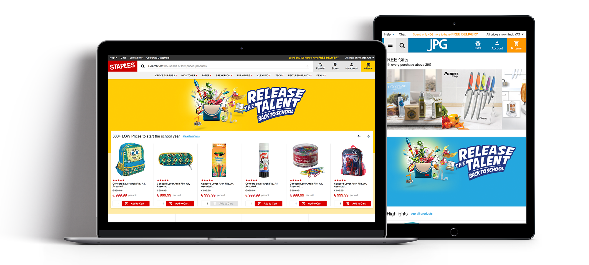
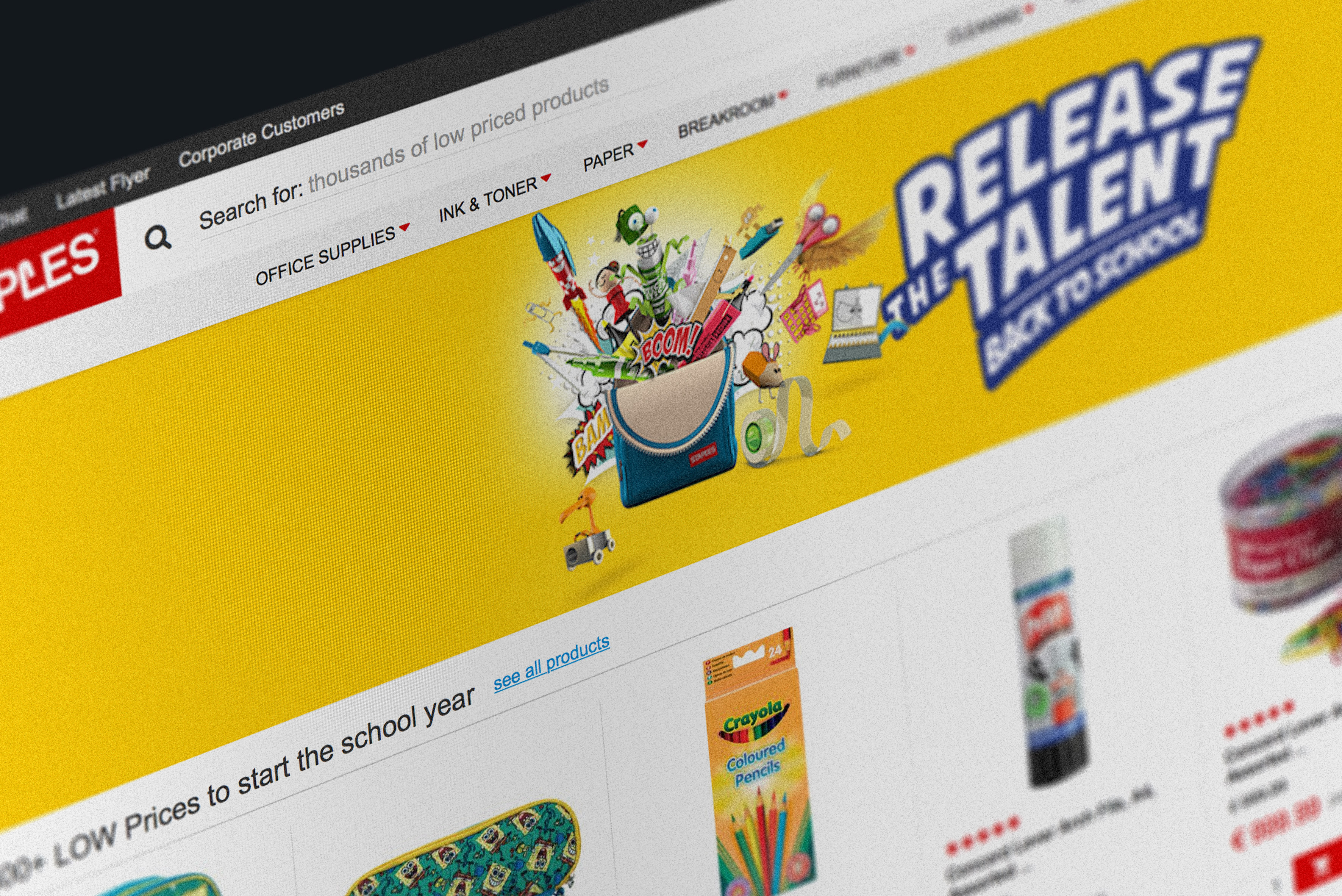
The homepage was cluttered with seamingly random deals and offers. All of it screaming for attention.
-
The business was changing
Two different selling models (or even brands) across Europe and both in need of a different approach.
-
In some countries, about 40% of the visitors were not being targeted.
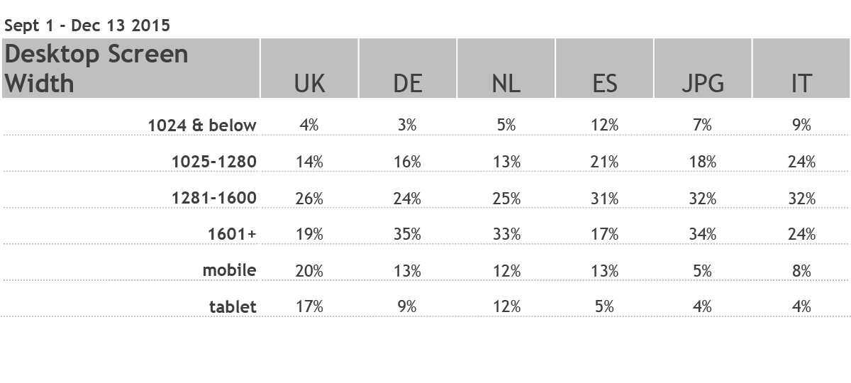
Website needed to be adaptive and display cleanly on mobile and tablet.
-
Customers couldn't find what they needed.
Clear customer feedback mentioned how hard it was to find categories for them to browse.
-
The CMS was not being optimised.
Ecom needed to provide an improved homepage framework that allowed for both global consistency and flexibility.
-
Internal processes were a heavy burden.
Too many limitations were in place but, on the other hand, too much customisation would introduce cost & complexity.
The process
-
Research and documentation
We collected insights, findings, thoughts and learnings from stakeholders as well as existing user and customer feedback.
-
Initial wireframes and low-fi designs
Quick pencil sketches and Axure
-
Iteration with Stakeholders and Business Experts
Going back to the people involved and figuring out how they perceive it, how would they use it, how much they make of it.
-
Proof of Concept – Prototype and hi-fi designs
Having the wireframes in Axure allowed for quick adaptive behaviour definition as well as interactive hi-fi prototypes for user testing.
-
User testing
We used the UserTesting screen recording and spot on user segmentation to get initial feedback and iterate over the prototype before the next session.
-
Handover and support implementation
All specs and behaviours were defined when the project went into the first sprint.
The solution
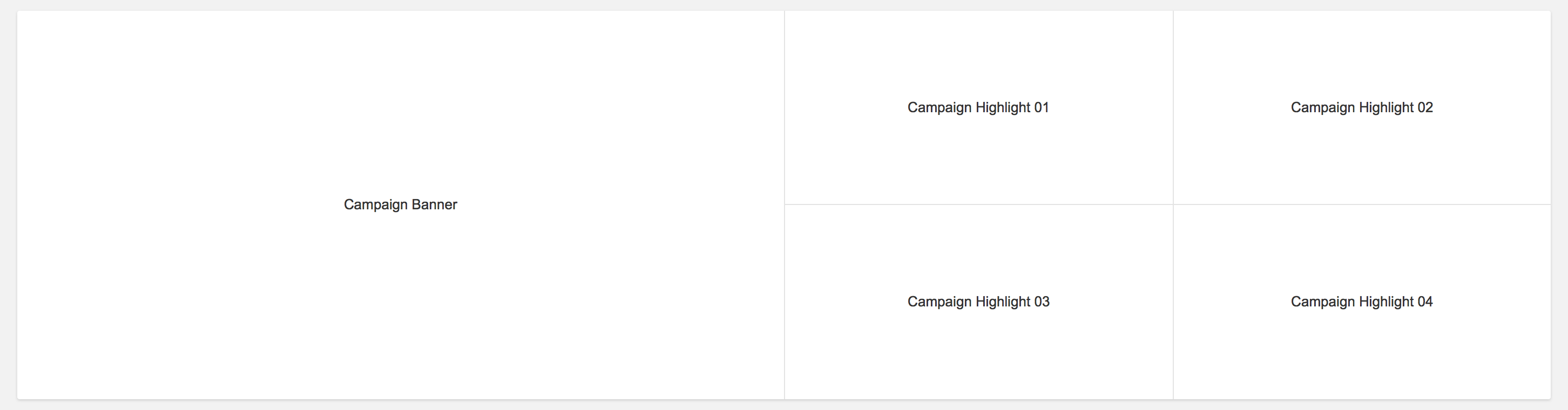
An adaptive and modular approach to the homepage; with the ability to mix & match up to 10 different category based modules.
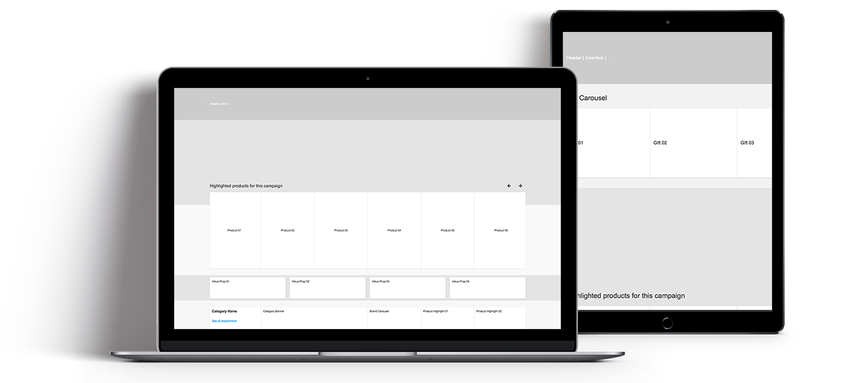
Category or campaign based module variations would stack on top of each other to create the homepage, allowing for customisation per country, per season or, at a later point in time, even per customer segment.
-
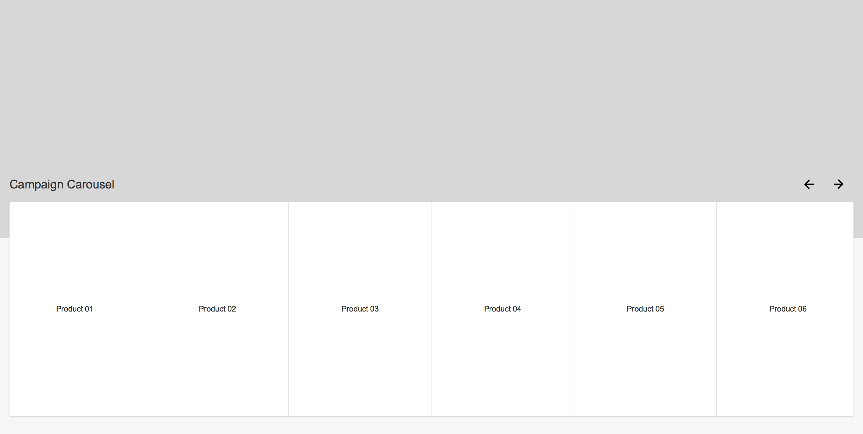
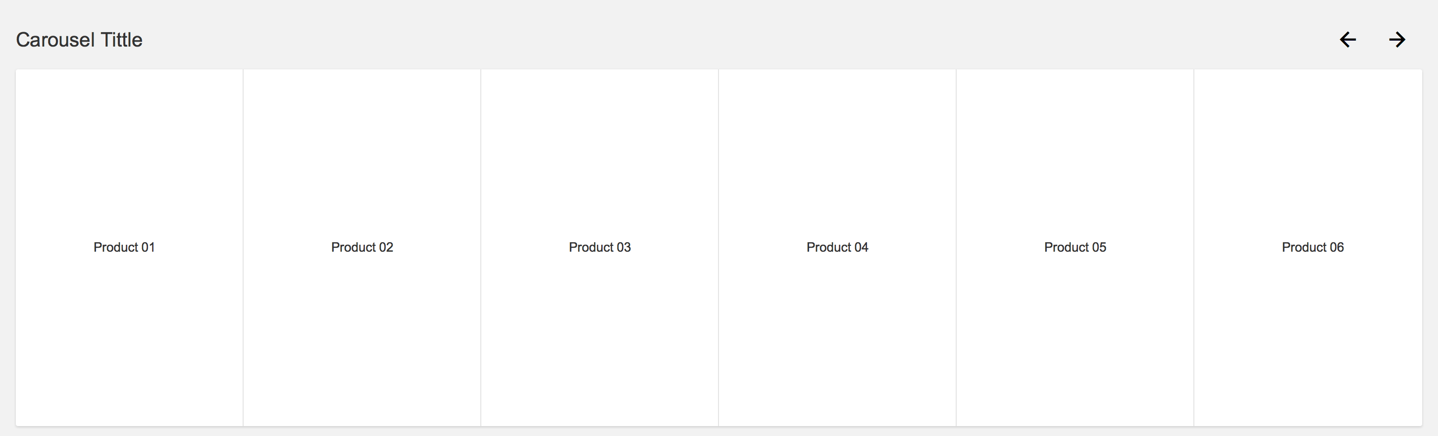
Campaign carousel
-
Product carousel
-
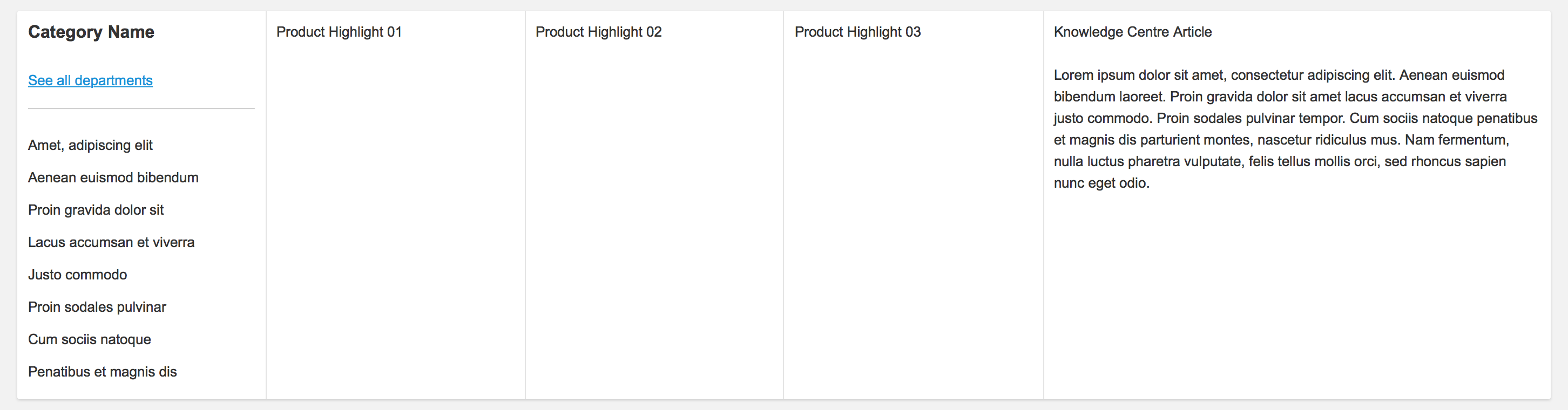
Category with article
-
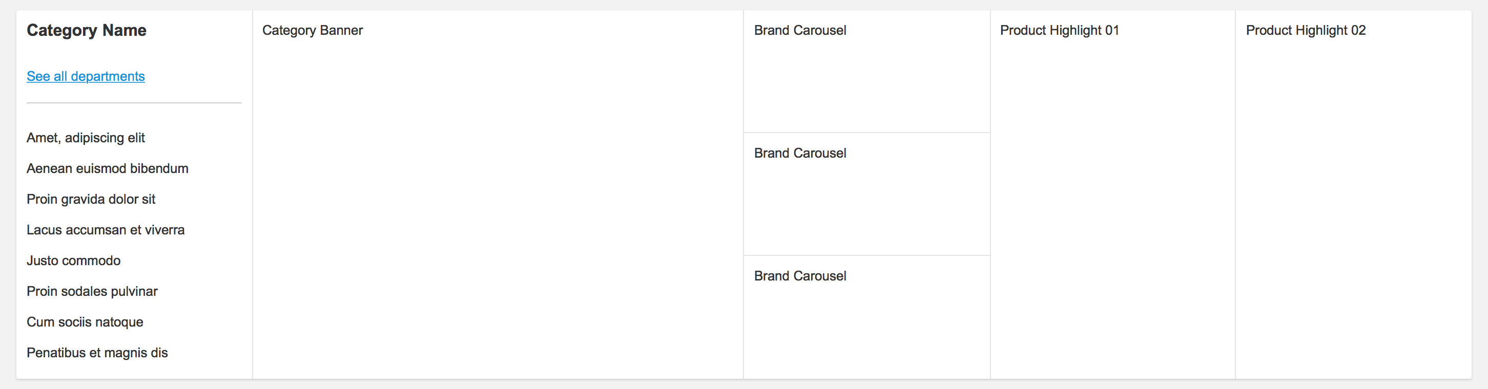
Category with highlighted brands
-
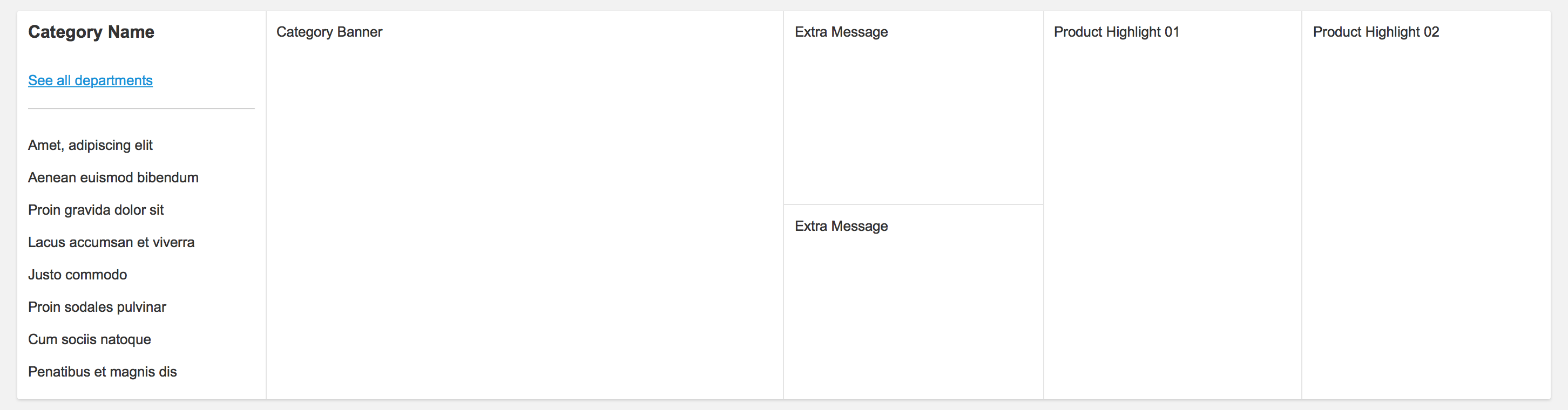
Category with additional message
-
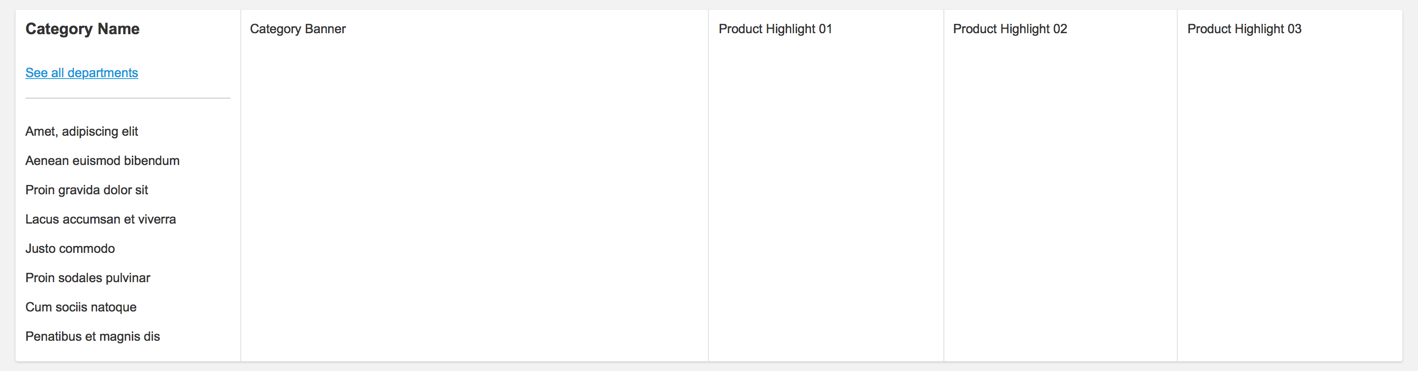
Category with highlighted products
-
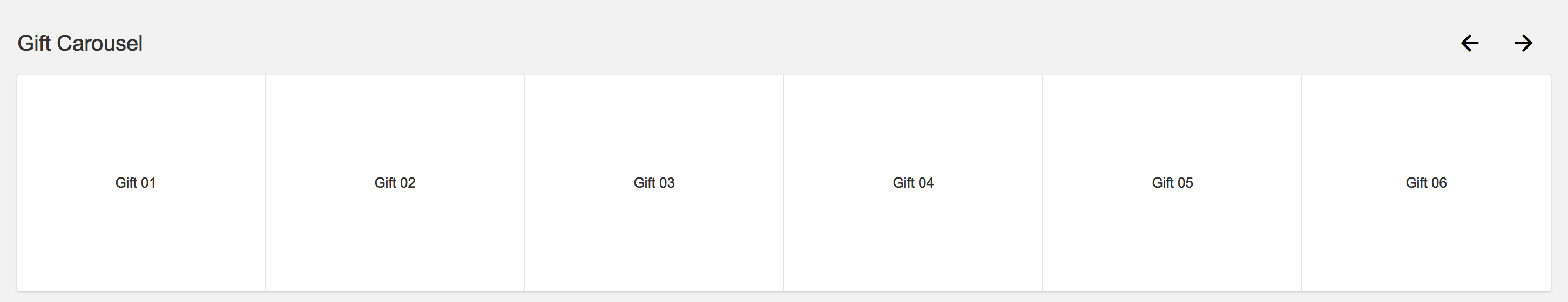
Gift offers
-
Promotional module
-
Value proposition

The results
It's never easy changing the way people work in but when you listen to them and involve them in that change, when everyone understands why a new solution is better, then it won't be easy to change it back.
Overall conversion rate growth of 130% across all business units was accompanied by a much more streamlined production process, allowing for faster reaction times when planning and implementing campaigns. Branding, for both business models, also benefited from the new uncluttered areas where campaigns could now communicate more effectively.